 Block Paving
 Paving Slabs
 Permeable Paving
 Retaining Walls
 Facing Bricks & Walling
 Kerbs & Edging
 Steps
Steps
0 products added
Products
Back




Choices about the colour of tactile paving should be based on how well it helps visually impaired people to differentiate the tactile paving slabs from their surroundings. In some cases, the colour itself also conveys additional safety information about the type of hazard.
Tactile paving patterns provide information about upcoming areas where extra caution is needed for the visually impaired, such as crossings, cycle lanes or platform edges. The colour and its tonal contrast are also important.
The subject of colour and tonal contrast of tactile paving slabs is covered in the ‘Guidance on the Use of Tactile Paving Surface’ document produced by the Department for Transport (DfT).
The use of the DfT guidance by designers and specifiers is strongly recommended. However, there are occasions where variations occur.
Approved Document M: Access to and use of buildings of the building regulations has some guidance on the use of tactile paving surfaces. However, it highlights the fact that The Equality Act 2010 (the EA) imposes additional duties on service providers and employers regarding adjustments to physical features that may disadvantage a disabled person. Complying with Approved Document M does not mean compliance with the EA. Therefore, specifiers should be aware of the obligations of the EA that may apply to their project.
The standard ‘BS 8300-1:2018 ‘Design of an accessible and inclusive built environment Part 1: External environment — Code of practice’ provides detailed and practical guidance on designing inclusive buildings in line with the requirements of the EA.
A TRL report commissioned by the DfT entitled ‘Accessible Public Realm: Updating Guidance and Further Research’ has examples of deviations from suggested colours and tonal contrast. Some of the examples are included in this blog.
Edinburgh’s Street Design Guidance document ‘M4 – Tactile Paving’ will also be explored. It shows how local guidance can differ from national guidance and influence colour requirements for tactile paving slabs.
Section 1.5.4 of the DfT’s ‘Guidance on the Use of Tactile Paving Surface’ document discusses the colour and tone contrast of tactile paving slabs.
It states that many visually impaired people have sufficient vision to detect contrasts in tone and colour. Therefore, tactile paving should visually contrast with surrounding surfaces to accentuate its presence, and its colour can also be used to convey additional information.
The DfT guidance states that the blister surface of tactile paving slabs should be red to indicate that an upcoming crossing is controlled. Red blister paving should not be used in any other circumstances.
Controlled crossings are classed as those crossings where pedestrians have priority in law. In this case, motorised vehicles and cycles must stop at a red light or give way. A detailed explanation of controlled and uncontrolled crossings can be found in section 2.3.1 of the DfT guide.
The DfT guide says that for uncontrolled crossings, the blister surface is usually buff. However, as long as it achieves an effective contrast with its surroundings, any colour – apart from red of course – can be used.
Here is an example from the TRL report where use of a different colour other than buff would have been beneficial.
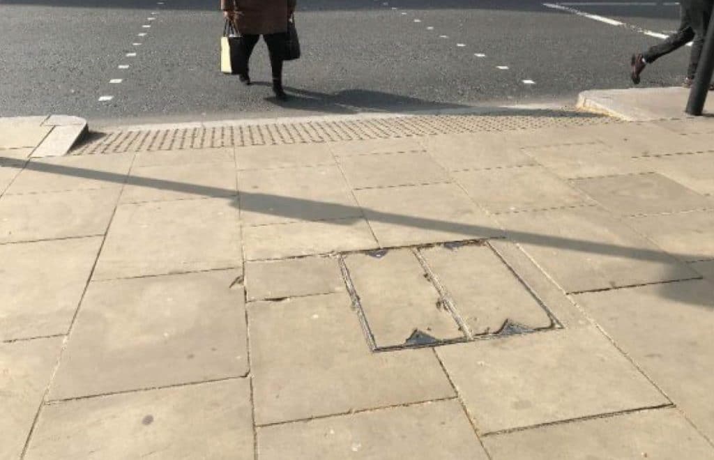
Here, red tactile paving slabs should have been used as this is a controlled crossing.
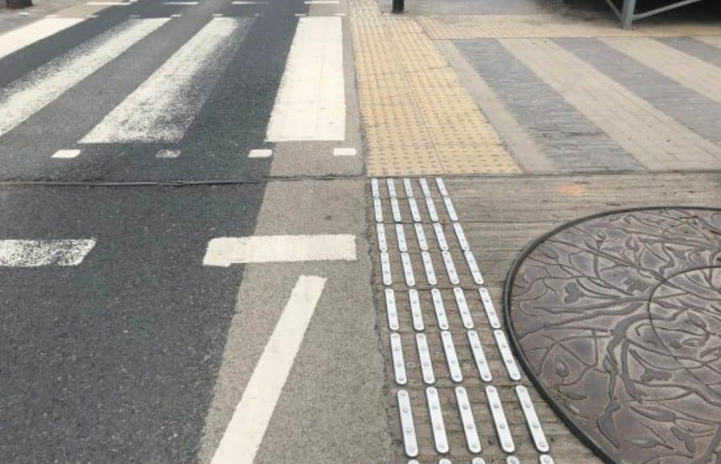
In conservation areas or near listed buildings, some flexibility in tactile paving colour may be allowed to match the surrounding materials. However, red must still be used only at controlled crossings. Any decision to relax colour requirements should involve consultation with visually impaired groups, mobility officers and the local conservation officer.
Here is an example in a heritage area where no coloured tactile paving slabs have been used and only metal studs differentiate the area to warn pedestrians of the crossing.

How to choose the right tactile blister slabs, tactile warning slabs and cycleway paving slabs for your public realm project.
If we look at the Edinburgh Street Design Guidance, it illustrates how tactile paving can depart from national guidance. It states that all tactile paving in Edinburgh should be of a contrasting grey colour. Within asphalt surfacing, this should be light grey. In areas featuring slab products, this should be charcoal grey.
The goal for Edinburgh council is to have all tactile paving in a contrasting grey colour that tones with the general footway colour. Red will only be allowed in exceptional circumstances where it is essential to avoid high-risk safety issues. As well as Edinburgh, the TRL report lists Transport for London and Westminster City Council as two other authorities where local guidance departs from that of the DfT.
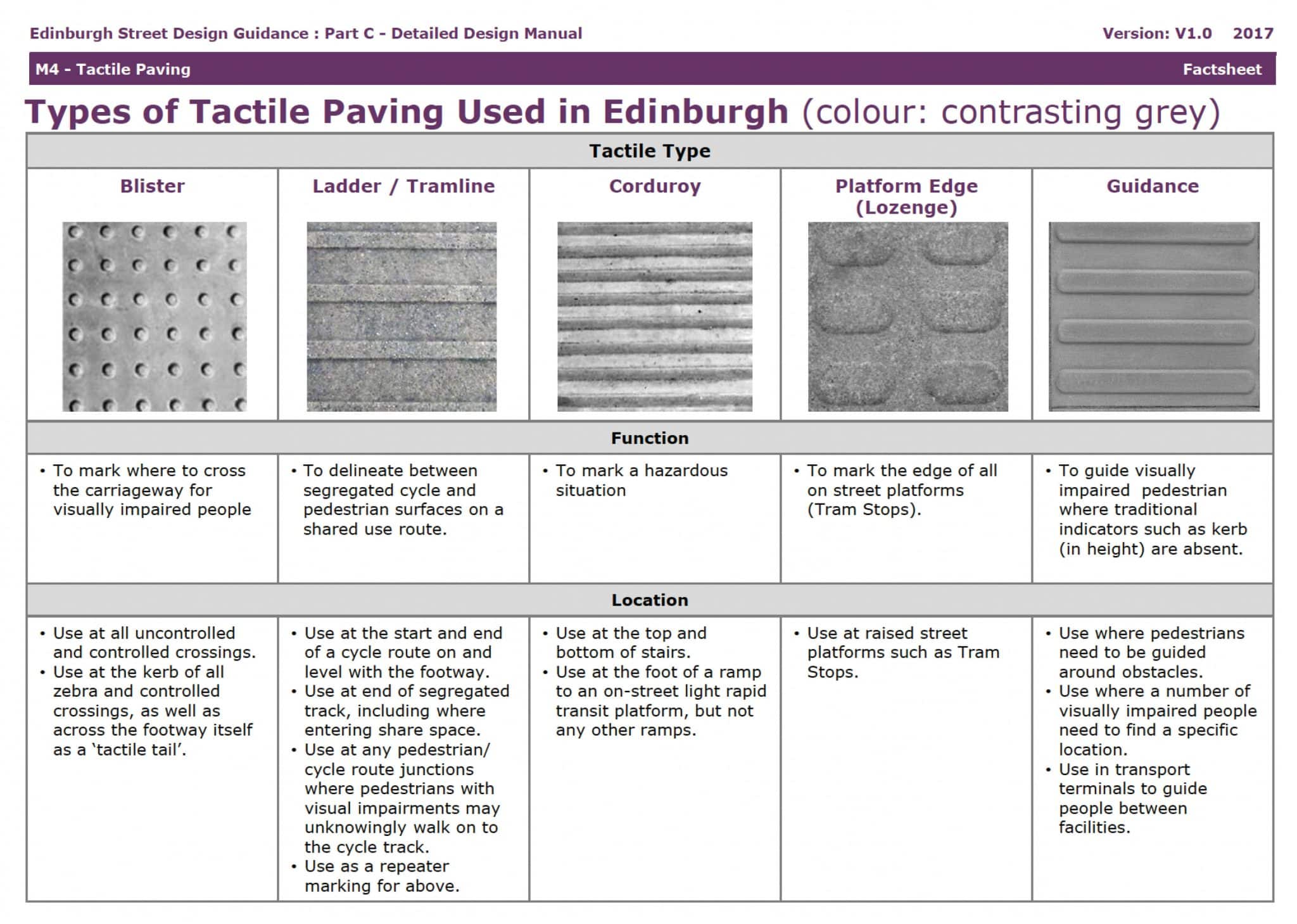
This is allowed for in the DfT guidance as some relaxation of the colour requirements may be acceptable in conservation areas or in the vicinity of a listed building, explaining why councils such as Edinburgh, London and Westminster City depart from the guidance as there is a large volume of conservation areas and listed buildings in these areas.
Tobermore has a range of tactile slabs available in suitable colours to help project designers create a safe and accessible environment for visually impaired pedestrians.
Craig McBride, Tobermore’s Technical and Product Training Manager, comments:
“We know the importance of creating hard landscaping areas that comply with the requirements of the relevant guidance – whether that be national or local. Our tactile paving is designed to meet a wide range of project requirements. We ensure that our customers can visualise its impact through our Virtual Sample Studio and we can incorporate their tactile paving slabs choices into our Hard Landscaping Proposal service.”
The Tobermore Virtual Sample Studio allows you to view hard landscaping materials from the comfort of your office. Our Hard Landscape Proposal service is designed to simplify your decision-making process by offering tailored solutions for your specific project needs.
As well as regulations, another source of useful information on specifying public realm steps is the standard BS 8300:2018 ‘Design of an accessible and inclusive built environment – External environment. Code of practice’.
This focuses on maximising inclusivity for a wider range of visitors above that of the building regulations and applies across the whole of the UK. Meeting BS 8300 is not a legal requirement, and the standard goes beyond the minimum regulatory accessibility requirements. However, it does provide specifiers with useful examples of best practise for incorporation into designs that maximise accessibility and inclusion.
These documents and standards provide specifiers with guidance on selecting the correct dimensions of step slabs and step risers to achieve regulatory compliance. However, it is always worth confirming with Building Control that the design and products you have selected do indeed comply before installation begins.
Ensure your project is accessible for partially sighted people with our range of Tactile slabs.